№ 11Design & type
The darkroom opens an hour later: revise both social posts before they go out
AI social media post design for a darkroom that now opens at 19:00. Use the cgfaces editor to change the time in both layouts before exporting.
№ 08Design & AI tools reviewTest
The best AI image generator for text has to get the small print right. We compare jar labels and shop posters, one letter at a time.
A jam jar on a pale terrazzo kitchen counter needs “Refrigerate after opening.” beneath the brand name. A repair café poster needs the right time and entry price, even behind reflective glass. These are modest text rendering jobs with little room for an almost-correct answer. We care as much about the full stop as the photograph.
The brand name gets the attention; the footer gets signed off with it. Start there. For a designer choosing an image for a client, a convincing label still needs every word checked against the supplied copy. We give the smaller type its own reading even when the headline looks convincing.
Our four briefs pair a flat paper proof with a physical scene. The briefs ask for a jam label wrapped around glass and a poster hung crooked in a shop window. Both use fictional copy. The question is whether each image keeps that copy readable as the surface and light become more demanding.
The comparison covers six vendors at the same cost per attempt, including Google Nano Banana 2.1 and OpenAI GPT-Image 2.6 Sunburst.
| Model | Reason for inclusion | Credits per run |
|---|---|---|
| Google Nano Banana 2.1 | Google entry for the packaging and poster briefs | 10 |
| OpenAI GPT-Image 2.6 Sunburst | OpenAI entry under the same small-print demands | 10 |
| FLUX.2 Flex | Adds Black Forest Labs at the same credit cost | 10 |
| Ideogram V3 Quality | Adds Ideogram with its Quality tier held fixed | 10 |
| Seedream 4.5 | Adds ByteDance to the vendor spread | 10 |
| Recraft V3 | Adds Recraft to the same photographic briefs | 10 |
On 10 November 2026, we ran six models × four briefs × three attempts in cgfaces AI Studio. 71 of 72 scheduled slots returned an image; the spend was 720 credits. Each slot requested one image. There were no retries or replacements; the close crops use existing images.
Every model received the same full prompt for each brief across three interleaved rounds, with model order shuffled each round. Output was square 1:1. Studio rewriting was off, as were Ideogram magic prompt and FLUX.2 Flex prompt upsampling; other provider settings stayed at Studio defaults. Studio confirmed unchanged prompts for every returned image. Failed generations count too.
A pass requires every line to match the requested case and characters, including punctuation and numbers. Straight and curly apostrophes both count. Every requested line must be present and unbroken, in the requested order. The brand or headline must be largest, with the footer visibly smaller than the weight or date line above it. Lettering must sit on the paper and follow its curve or tilt; brief D also requires a tilted poster. Extra lettering elsewhere in the scene is noted but does not fail a run.
Each pair requests the same wording and type hierarchy. We like the plain cream stock here: it gives the lettering room without turning the scene into a blank backdrop. The model beside each example identifies its source; every model in the table received all four briefs.
For your own copy, Prompt Crafter can help turn rough notes into a prompt. Settle the wording before comparing models. The prompt-engineering guide covers the broader process.
A flat proof gives you a clear view of the small type before the jar adds a curve. The small footer deserves as close a reading as the bold brand line.
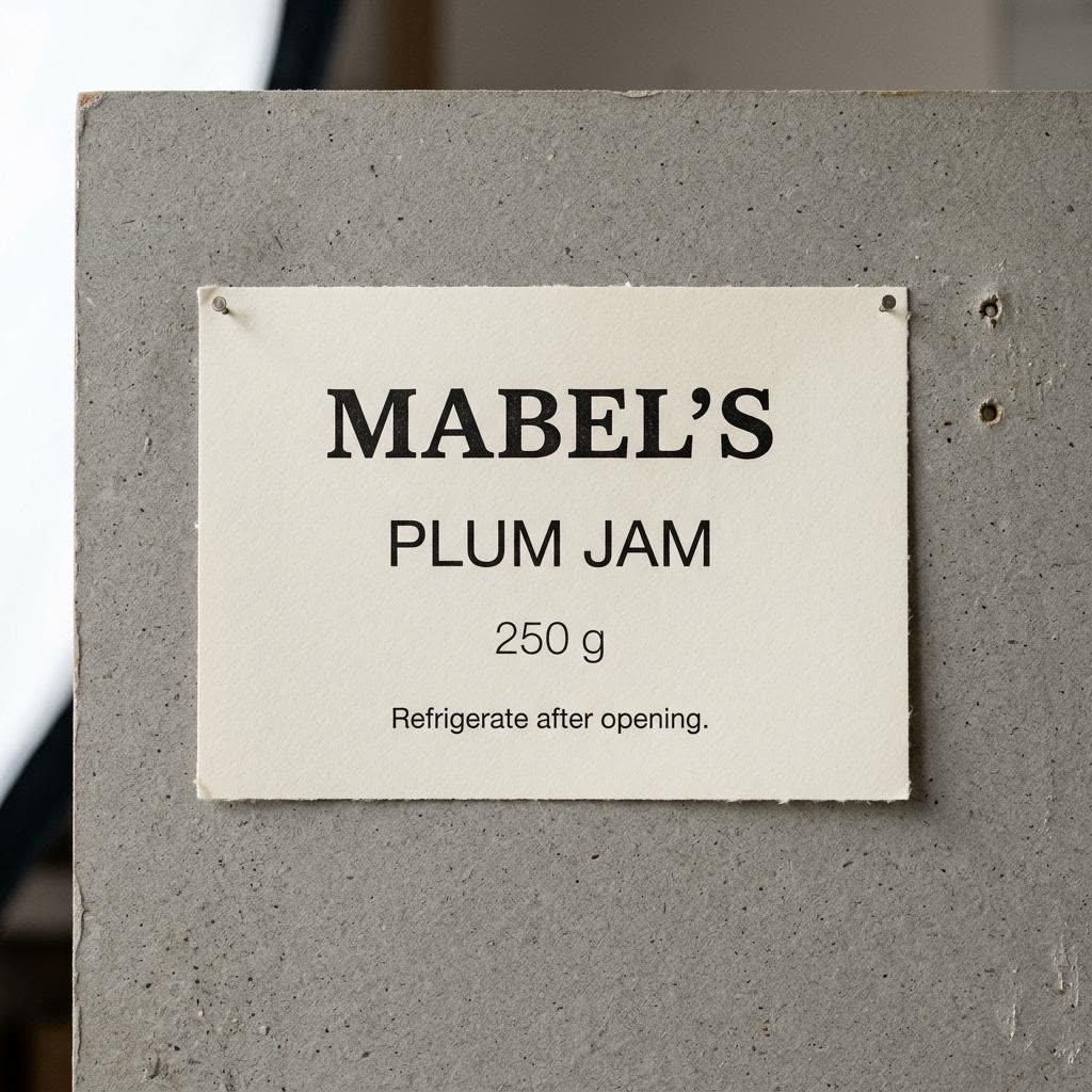
Nano Banana 2.1 run A1 passes with exact copy and the footer smallest.
Product proof photography. Straight-on close-up of a flat cream paper jam label pinned to a grey board in a small print workshop. The rectangular label fills 65% of the square frame width and 40% of its height. Four centred lines read exactly, from top to bottom: "MABEL'S", "PLUM JAM", "250 g", "Refrigerate after opening." Use black ink on uncoated paper, a bold serif brand line and plain sans-serif supporting type. The respective letter heights are 5%, 3%, 1.8% and 1.2% of the full frame height. Keep the footer on one line, with open space between all four lines. Paper fibres show at the edges; the board has two old pinholes beside the label. A large softbox from the left gives even light across the lettering. Neutral afternoon colour, workbench quiet. Canon EOS R5 with RF 100mm f/2.8L Macro at f/8, sensor parallel to the paper for a level proof with crisp edges.
The prompt puts the same wording on a curved paper label in clear morning sun. The reflections belong beside the lettering, where they can describe the jar without covering the copy. Look especially at the ends of the footer.
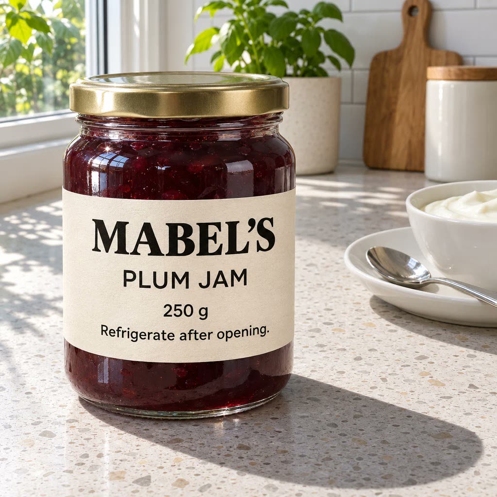
GPT-Image 2.6 Sunburst run B1 passes with exact copy and a footer smaller than the weight line.
Product photography. Gentle three-quarter close-up of a cylindrical glass jar of dark plum jam standing on a clean pale terrazzo counter in a contemporary kitchen. A cream uncoated paper label curves around the glass; its visible area fills 65% of the square frame width and 40% of its height. Four centred lines read exactly, from top to bottom: "MABEL'S", "PLUM JAM", "250 g", "Refrigerate after opening." Use black ink, a bold serif brand line and plain sans-serif supporting type. The respective letter heights are 5%, 3%, 1.8% and 1.2% of the full frame height. Keep the footer on one line, with all lettering visible on the front-facing curve. A small spoon rests on a white saucer beside a bowl of plain yoghurt at the edge of the frame. Clear morning sun through a window on the left casts a crisp jar shadow across the counter; reflections fall beside the lettering. Natural colour, dark plum jam against pale surfaces. Everything clean and well kept, matter-of-fact mood. Canon EOS R5 with RF 100mm f/2.8L Macro at f/8 to hold the curved label in focus.
The date line and price carry the practical information. A tidy headline cannot compensate for a missing colon in “18:30” or a changed decimal point in “€7.50”.
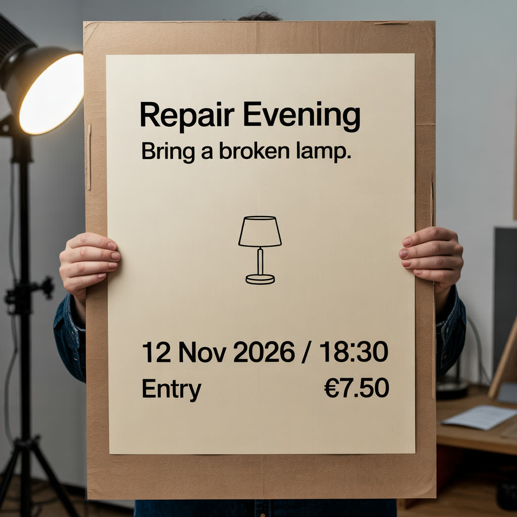
Ideogram V3 Quality run C1 fails with “Repair Evening” and “12 Nov 2026” in the wrong case.
Print proof photography. Straight-on close-up of a flat cream repair-evening poster held against a grey workshop proof board. The poster fills 65% of the square frame width and 80% of its height. Four centred lines read exactly: "REPAIR EVENING" near the top, "Bring a broken lamp." beneath it, "12 NOV 2026 / 18:30" in the lower third and "Entry €7.50" near the foot. Use black sans-serif type with a bold headline; respective letter heights are 5%, 2.5%, 1.8% and 1.2% of the full frame height. Keep each phrase on one line. A small black line drawing of a table lamp occupies the open middle area. Uncoated paper has a slightly rough lower edge. A softbox from the left lights the complete paper evenly. Neutral afternoon colour, practical workshop mood. Nikon D850 with Nikkor 24–70mm f/2.8E ED VR at 70mm and f/8, sensor parallel to the board for straight edges.
The window brief asks for a clean poster hung slightly crooked inside a repair café’s plate-glass window, with low afternoon sun and faint street reflections. The text should follow the paper’s tilt and remain readable between the reflections.
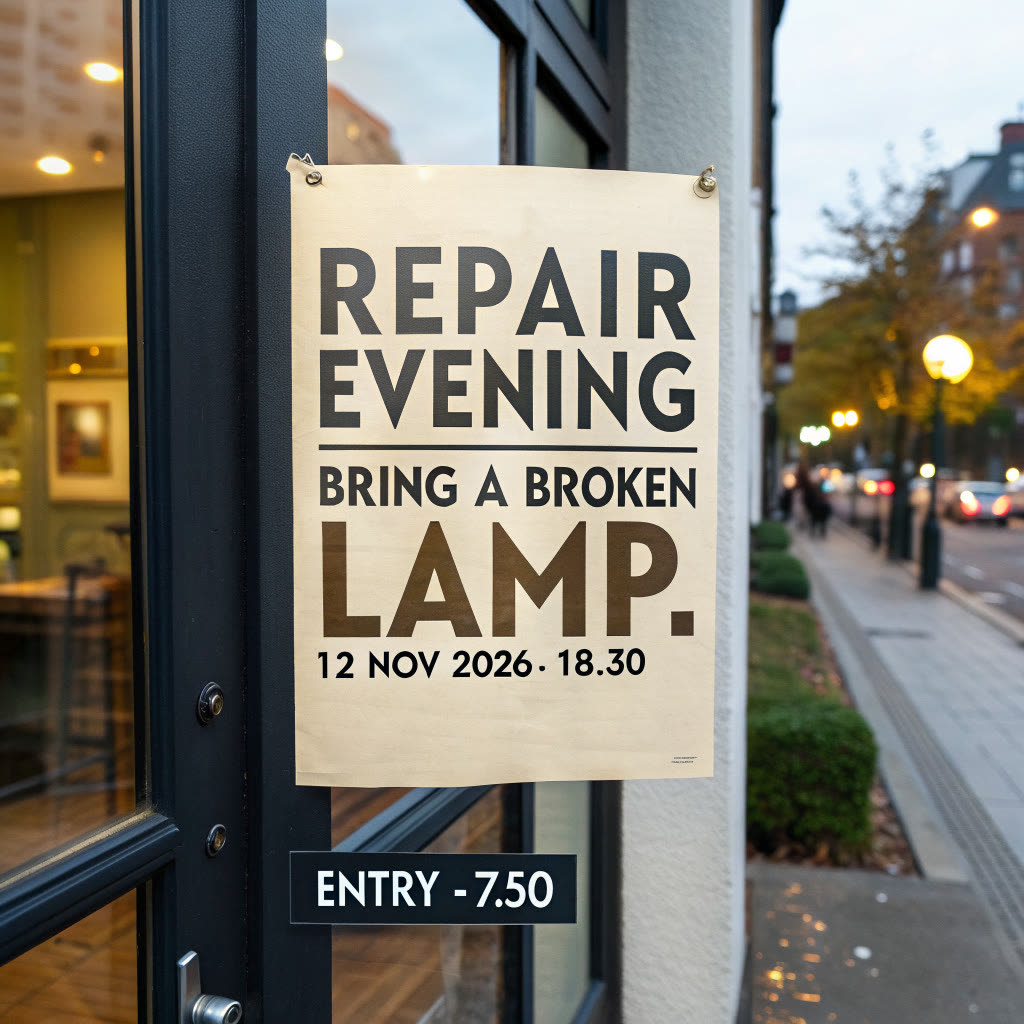
Recraft V3 run D1 fails with “18.30” and a separate sign below the poster reading “ENTRY - 7.50”.
Documentary photograph. Straight-on close-up of a cream repair-evening poster taped three degrees clockwise inside the plate-glass window of a contemporary repair café. The poster fills 65% of the square frame width and 80% of its height. Four centred lines read exactly: "REPAIR EVENING" near the top, "Bring a broken lamp." beneath it, "12 NOV 2026 / 18:30" in the lower third and "Entry €7.50" near the foot. Use black sans-serif type with a bold headline; respective letter heights are 5%, 2.5%, 1.8% and 1.2% of the full frame height. Keep each phrase on one line. A small black line drawing of a table lamp occupies the open middle area. Clean paper with crisp corners sits behind clear tape, with a white steel workbench visible beyond the paper. Low late-afternoon sun from the left lights the window and casts sharp shadows inside; faint street reflections sit between the lines. Natural colour, warm cream paper and blue sky reflected in the glass. Everything clean and well kept, matter-of-fact mood. Nikon D850 with Nikkor 24–70mm f/2.8E ED VR at 70mm and f/8 to keep the full poster readable through the glass.
Each cell counts complete passes out of three attempts. Read the counts by job. A flat label and a notice behind glass ask different things of an image. Three runs give a small working sample, so a one-image lead needs that context.
| Model | A: flat label /3 | B: jar /3 | C: flat poster /3 | D: window /3 |
|---|---|---|---|---|
| Google Nano Banana 2.1 | 3 | 3 | 3 | 1 |
| OpenAI GPT-Image 2.6 Sunburst | 2 | 3 | 3 | 3 |
| FLUX.2 Flex | 0 | 0 | 0 | 0 |
| Ideogram V3 Quality | 0 | 0 | 0 | 0 |
| Seedream 4.5 | 3 | 0 | 0 | 0 |
| Recraft V3 | 0 | 0 | 0 | 0 |
GPT-Image 2.6 Sunburst run A1 returned no image after the Studio’s 100-second gateway timeout. It was charged and counts as a failed attempt.
Ideogram V3 Quality run B2 shows a clean, believable jar with an extra “150 g” beneath the requested “250 g”. It also changes “MABEL'S” to “Mabel's” and “PLUM JAM” to “Plum Jam”. The second weight is easy to miss if you stop at the jar’s appearance.
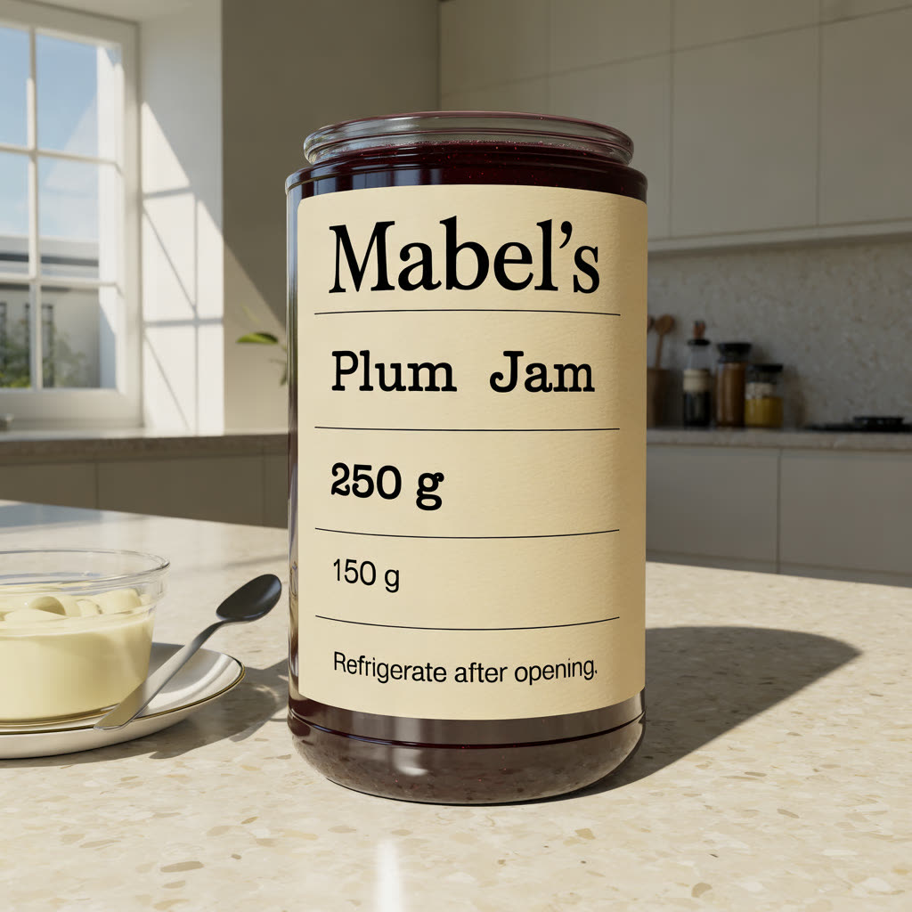
Run B2, Ideogram V3 Quality: an extra “150 g” beneath “250 g”.
The footer needs to belong to the curved paper. We would compare the ends of “Refrigerate after opening.” with the flat proof before judging the styling. Keep the full jar beside a detail crop so you can see whether the line has grown to make itself readable.
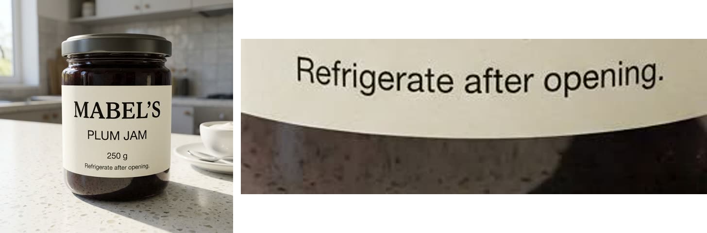
Google Nano Banana 2.1, run B1; footer crop shown at about 2.7×.
“Refrigerate after opening.” curves with the label on one line. The full stop is present.
Product photography. Gentle three-quarter close-up of a cylindrical glass jar of dark plum jam standing on a clean pale terrazzo counter in a contemporary kitchen. A cream uncoated paper label curves around the glass; its visible area fills 65% of the square frame width and 40% of its height. Four centred lines read exactly, from top to bottom: "MABEL'S", "PLUM JAM", "250 g", "Refrigerate after opening." Use black ink, a bold serif brand line and plain sans-serif supporting type. The respective letter heights are 5%, 3%, 1.8% and 1.2% of the full frame height. Keep the footer on one line, with all lettering visible on the front-facing curve. A small spoon rests on a white saucer beside a bowl of plain yoghurt at the edge of the frame. Clear morning sun through a window on the left casts a crisp jar shadow across the counter; reflections fall beside the lettering. Natural colour, dark plum jam against pale surfaces. Everything clean and well kept, matter-of-fact mood. Canon EOS R5 with RF 100mm f/2.8L Macro at f/8 to hold the curved label in focus.
Nano Banana 2.1 passed all three flat labels and all three jars. GPT-Image 2.6 Sunburst kept the copy exact on every returned label image: two flat proofs and all three jars passed. Both kept the footer smaller than the weight line.
Seedream 4.5 passed all three flat labels; its ruled boxes and empty bottom row were styling additions. None of its jars passed. B1 and B2 broke “PLUM JAM” over two lines, and B1 wrapped the footer. B3 merged brand and product lines and moved “250 g” to the side.
The other three models produced no usable jar under these rules. FLUX.2 Flex kept the wording right but made the brand and product lines the same size, with the footer as large as the weight line. Ideogram V3 Quality changed case and wrapped the footer; B2 also added that second weight. Recraft V3 printed “Refrigerate After Oponing” in B2 and “Refigerate after / opening.” in B3.
For another packaging scene, the photorealistic prompt examples offer directions for the setting once you have settled the label.
The crisp paper corners make the poster’s tilt easy to judge. Its price should be just as clear: we would reject one that takes a second guess to read. Compare the date and footer with the flat poster, then check whether every line follows the paper’s tilt.
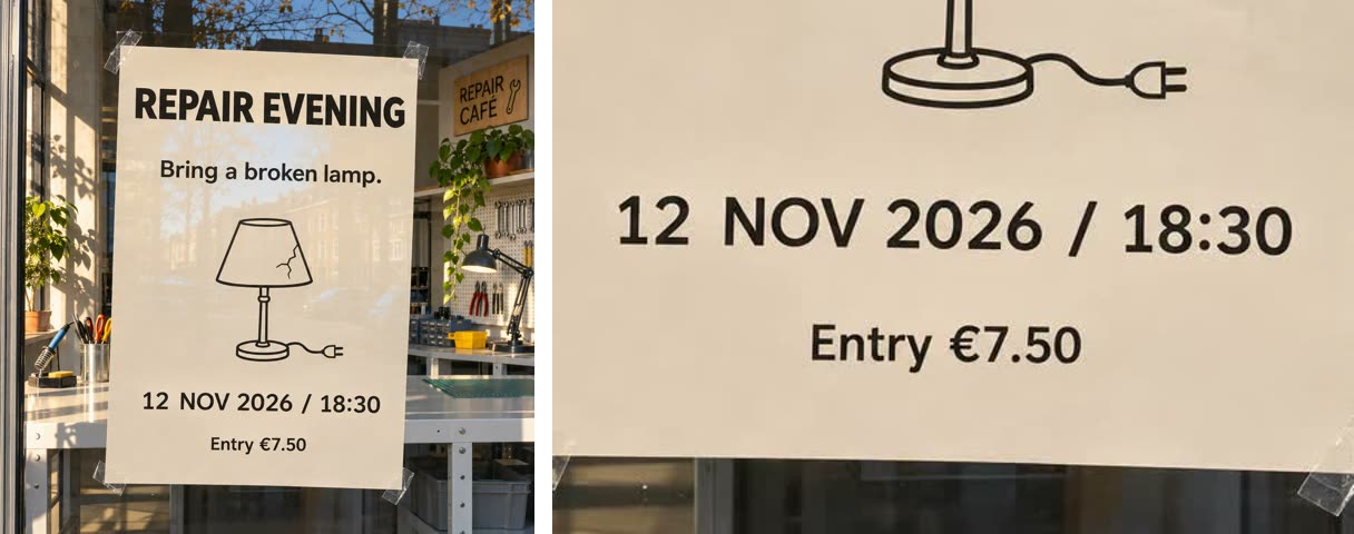
OpenAI GPT-Image 2.6 Sunburst, run D1; date and footer crop shown at about 1.3×.
“12 NOV 2026 / 18:30” and “Entry €7.50” are exact. The footer is smaller than the date, and both lines follow the paper’s slight tilt.
Documentary photograph. Straight-on close-up of a cream repair-evening poster taped three degrees clockwise inside the plate-glass window of a contemporary repair café. The poster fills 65% of the square frame width and 80% of its height. Four centred lines read exactly: "REPAIR EVENING" near the top, "Bring a broken lamp." beneath it, "12 NOV 2026 / 18:30" in the lower third and "Entry €7.50" near the foot. Use black sans-serif type with a bold headline; respective letter heights are 5%, 2.5%, 1.8% and 1.2% of the full frame height. Keep each phrase on one line. A small black line drawing of a table lamp occupies the open middle area. Clean paper with crisp corners sits behind clear tape, with a white steel workbench visible beyond the paper. Low late-afternoon sun from the left lights the window and casts sharp shadows inside; faint street reflections sit between the lines. Natural colour, warm cream paper and blue sky reflected in the glass. Everything clean and well kept, matter-of-fact mood. Nikon D850 with Nikkor 24–70mm f/2.8E ED VR at 70mm and f/8 to keep the full poster readable through the glass.
GPT-Image 2.6 Sunburst passed all three flat posters and all three windows. Its window posters tilted slightly, with the lines following the paper. Nano Banana 2.1 passed all three flat posters but only window run D2. D1 and D3 kept every line exact and hung the poster straight.
FLUX.2 Flex got every character right in all six poster runs, but “Entry €7.50” was as large as the date line each time. Its window posters tilted anticlockwise.
Ideogram V3 Quality changed case and split “Entry” from “€7.50”. The C1 example above also makes the footer as large as the date. C3 printed “18.30” and repeated “ENTRY”. Recraft V3 changed the year to “2023” and the price to “ENTRY 750” in C1. Its D1 example above wraps the lamp line and puts “ENTRY - 7.50” on a separate sign below the paper.
Seedream 4.5 split “REPAIR EVENING” across two lines in all flat posters and in D1 and D3. D2 kept the copy on one line but straightened the poster. Every poster footer was as large as the date; D3 also moved the date above the lamp.
GPT-Image also added lettering outside the paper: a “print / trim / hang” sticky note beside C1 and “Repair Café” signs inside all three window scenes. Those additions do not fail the brief, but you would need to check or remove them for client work.
The Promptography article explores the photographic choices around a scene like this. Here, the window light has to leave the event information readable.
Keep the approved copy beside the image throughout the check. Begin with the smallest line and read it aloud, including its punctuation. Then compare each character with the source. For this jar, that means checking the final full stop as deliberately as the apostrophe in “MABEL'S”.
Give numbers a separate reading. Match the poster’s date one digit at a time, then its time and price. Read what is visibly there before looking back at what you asked for. If a character needs guessing, mark the line for correction.
Check for extra wording as well as missing copy. Trace each requested line to its place in the image, then read any other lettering you can see. If the prompt asks for “250 g”, a second weight elsewhere on the jar needs attention too. For a client job, use the approved artwork as your copy source.
Next, look at the whole image at the size your audience will see it. A close crop helps you inspect a letter, but the footer also needs to read on the finished shop post or printed proof. Check the ends of lines where paper curves away and anywhere a reflection crosses a stroke. A correct letter can still be unusable when the line is too faint to read. Keep that distinction in your correction note so you know whether to repair the copy or its presentation.
Keep a short correction note beside each failed line. After a repair or fresh generation, proof the whole image again before exporting. We would give the final export one last reading at its intended size, even when the correction was only a single character.
For these packaging briefs, choose Nano Banana 2.1 or GPT-Image 2.6 Sunburst. Nano Banana passed 3/3 flat labels and 3/3 jars; GPT-Image passed 2/3 flat labels and 3/3 jars, with the timeout counted as a failed label attempt. You still need to proofread every line.
For this shop-window notice, choose GPT-Image 2.6 Sunburst: 3/3 windows passed against Nano Banana’s 1/3. Check the rest of the scene for extra signs as well as reading the poster.
FLUX.2 Flex is an option when wording matters and you will resize the footer yourself in an editor. It passed 0/3 in every brief; labels also need the brand made larger than the product line.
Keep Seedream 4.5 to flat label proofs here: 3/3 passed, against 0/3 in each other brief. If Ideogram V3 Quality or Recraft V3 is your only option, set the small lines by hand in an editor and check the larger copy too. Both passed 0/3 in every brief.
№ 08 · Design & AI tools reviewAll stories
№ 11Design & type
AI social media post design for a darkroom that now opens at 19:00. Use the cgfaces editor to change the time in both layouts before exporting.
№ 10Photography
Make an AI photo essay from one imaginary roll of 36 frames. Spend the last wash at a fictional launderette, then edit your roll down to six.
№ 09Photography
AI headshots that look real still need the person’s approval. Use their feedback to make a team portrait they would choose for their own LinkedIn profile.